Hey everyone,
We have redesigned the work item detail page.
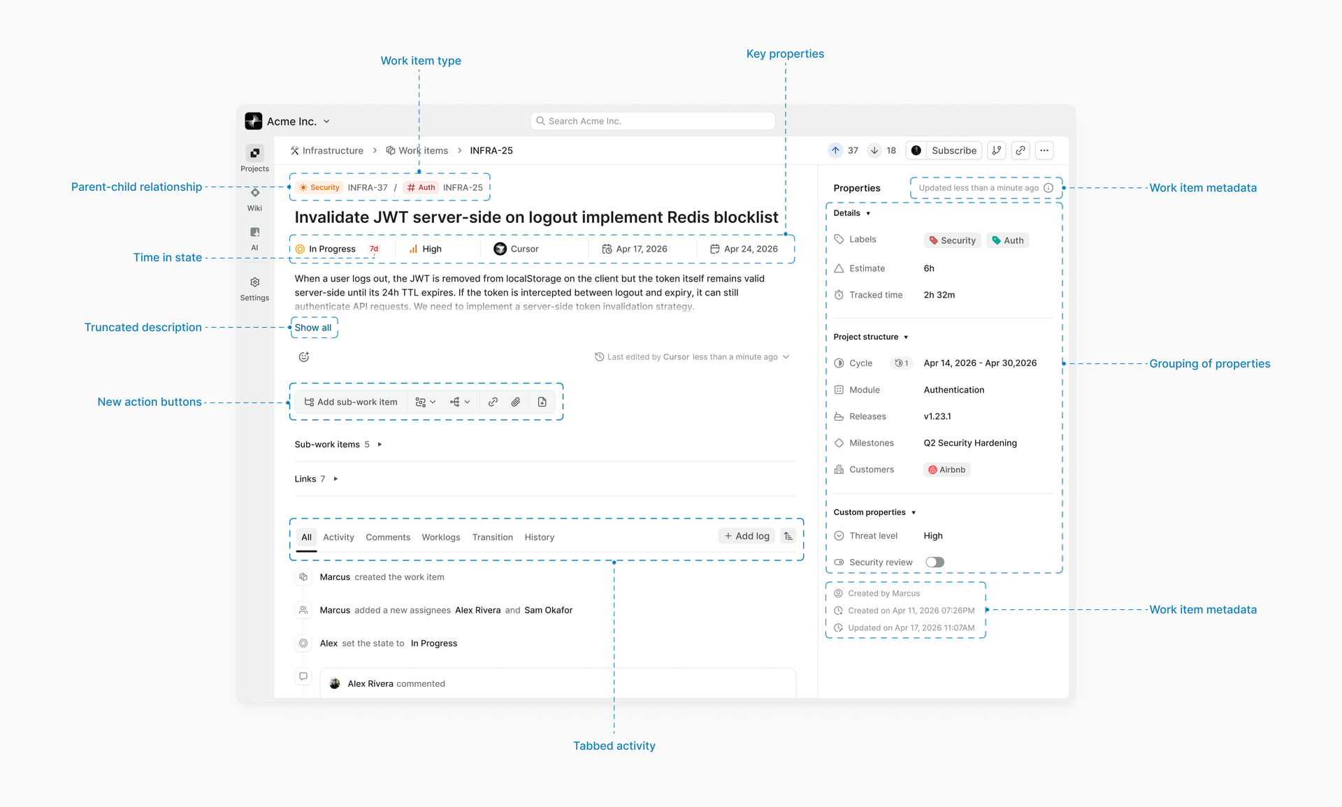
If you’ve been using Plane for a while, you’ve probably noticed the detail page getting heavier as we added more features to it. The layout hadn’t changed much since our launch, and with custom properties, relations, work logs, and everything else we’ve shipped since then, it was due for a rethink.
Here’s what’s different,
- Properties are now grouped into three collapsible sections (Details, Project structure, Custom properties) instead of one flat list
- State, priority, assignee, start date, and due date are promoted to the center column below the title
- Activity is split into tabs: All, Comments, History, Transitions, Worklogs
- History now shows old and new values for every property change
- Descriptions truncate on long work items with a “show more” option
- Action buttons are consolidated into icon groups
A lot of these changes came directly from community requests and from watching how people actually use the page. The activity tabs in particular were one of the most requested changes.
We’re also working toward custom property grouping and a customizable detail view per user, so this is the foundation for more to come.
Full post with the design decisions, research process, here. Drop in your thoughts, feedback, anything ![]()